When we redesigned the Reports section at Recruiterbox, one of the things we wanted to do was to make them look “nice”, especially the charts. Until now, we’ve been mostly using the default colors provided by Google’s charting library, which looks so BAD! Ok, “bad” is subjective, it at least doesn’t go well with our color palette.
But how do you come up with so many colors that look nice on charts, while being consistent with your color palette?
FUNDA
When I started researching, the first thing I learned was that there are three different types of charts and there are corresponding ways of choosing color palettes:
- Sequential
- Diverging
- Qualitative/Categorical
Sequential and diverging palettes are used to represent values that vary continuously, from low to high or high to low. E.g. population density (sequential), altitude (diverging). However, these are mostly relevant when the values are represented on a map, and cannot be conveyed by something like the size of a bar in a bar chart.
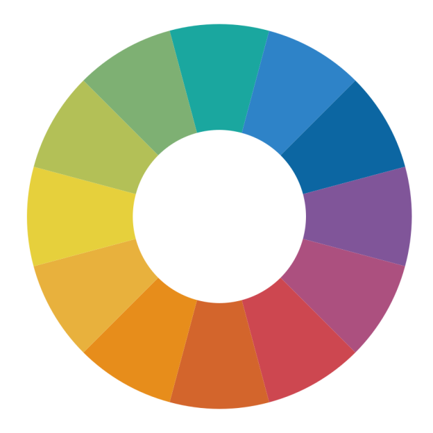
Categorical palettes are the ones that are used to separate items into distinct groups. This is the kind of data we primarily represent in our reports. As such groups have no inherent order, categorical palettes typically contain colors of different hues.
So, these are the two criteria I derived for designing a categorical palette:
- The colors should be distinct enough from each other
- The color should feel like they belong to the same family (some of them should not stand out among others)
ITERATIONS
Alright, moving from the funda part, the next challenge was to come up with enough number of colors required for charts that satisfy the above criteria. I’m happy that I came across this article from a company called Viget, about how they solved exactly the same problem.
Following the same process, we came up with our new palette after multiple iterations between me and Sneha (our visual designer). And it was fun to watch people going crazy looking at the iterations.


For people who are curious about the iterations, here you go:
https://www.dropbox.com/sh/zmz7zy1781zfbe1/AABwJL0wUmHQOKtNzBMsoiega?dl=0
END RESULT
So after all these tweakings, this is the new color palette we have come up with. I’m super happy about the result. We’re yet to put it out on charts with real data and see how it works though.

